SKUTURE
Branding
Animation
3D
Illustration
Project Overview
Client: Skulture Skateshop
Industry: Skateboarding / Community / Lifestyle
Focus: Team Identity & Brand Communication
Skulture Skateshop is built on more than just skill—it’s driven by passion, community, and a strong sense of belonging. At its core is a team that represents the true spirit of the brand.
More than riders, the Skulture team functions as a family. They inspire one another, push creative and physical boundaries, and embody the values the shop stands for. Their dedication reflects a shared commitment—not just to skateboarding, but to the culture surrounding it.
Behind Skulture Skateshop lies a team that’s not just about skill, but about heart.Our team isn’t just riders; they’re family.They inspire, push boundaries and embody what we as a shop believe in.We are in this for the love, we sweat for the shop and so is our team!

About the Central Symbol
2.1
5


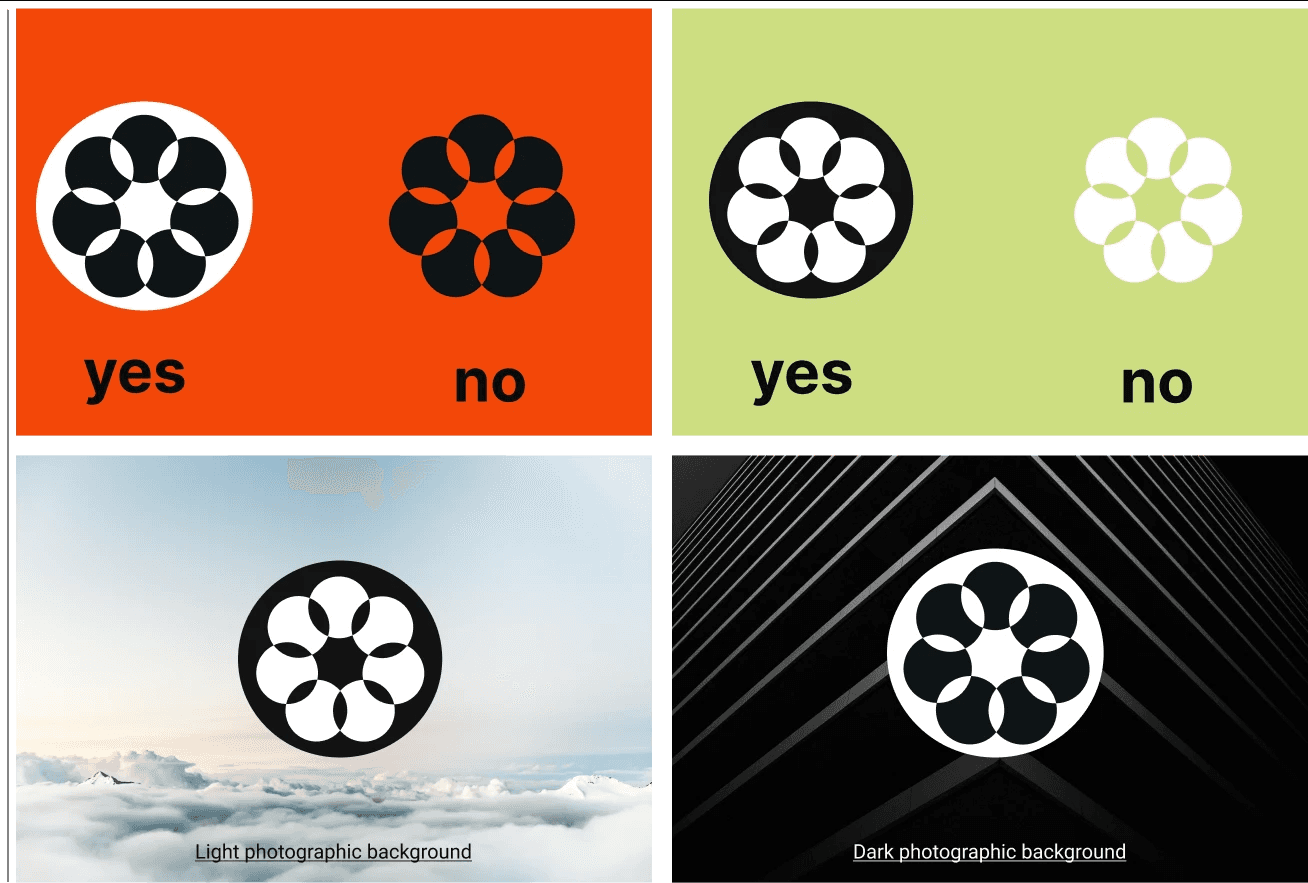
The central symbol represents the fusion of mechanical precision and organic growth. Inspired by the wheel bearing, it embodies motion, strength, and interconnectedness.The flower element signifies growth, creativity, and a human-centered perspective. Together, these components reflect our dedication to progress, innovation, and harmonious design.
On the following pages of this manual, you will find various adaptations and applications of the central symbol, ensuring its consistent and effective use.


Color Palette
shapes
The primary inspiration for the shapes and colors comes from the most unifying space for skaters: the skatepark bowl. This iconic element reflects the community, energy, and dynamic movement central to skate culture.